
PAVOI 14K Gold Plated Station Necklace | Simulated Diamond BTY Necklace | Womens CZ Chain Necklace | Layering Necklaces
$27.35
Description
Details:
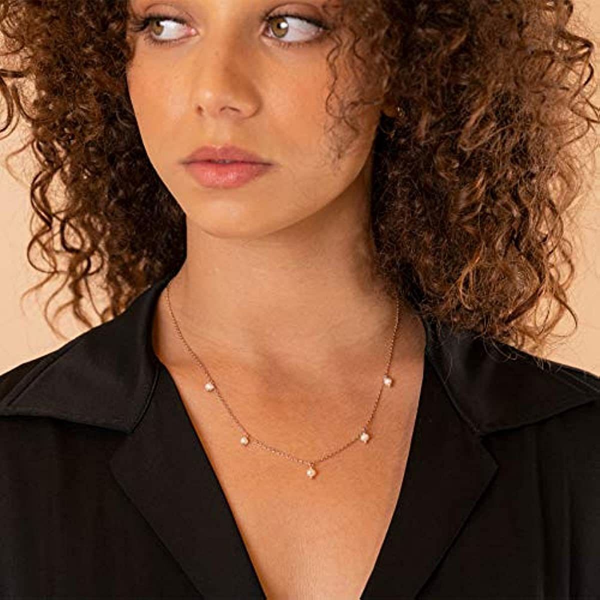
ETERNAL ROMANCE: Rose Gold Appeals for its Originality, its Gentleness and its Poetry. Rose Gold is a Very Resistant Metal. Is Very Strong and is Difficult to Scratch.
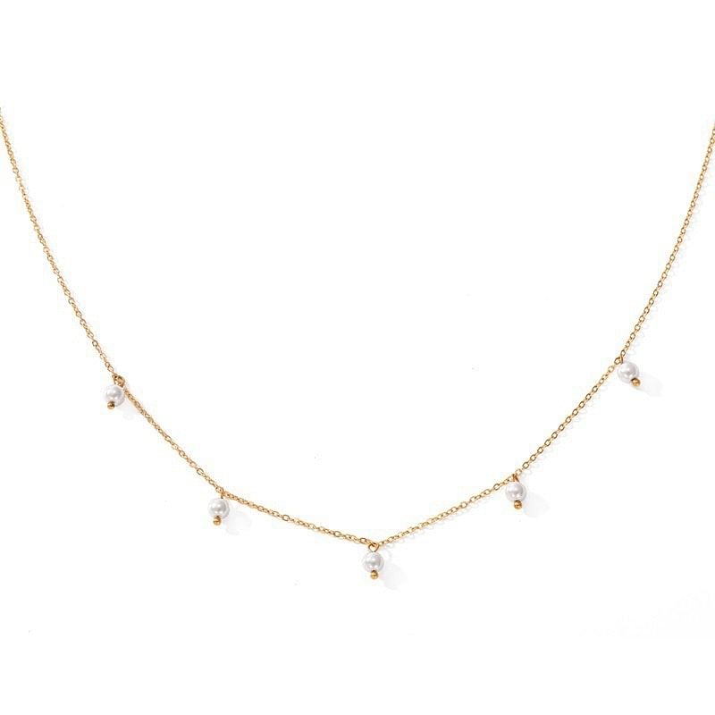
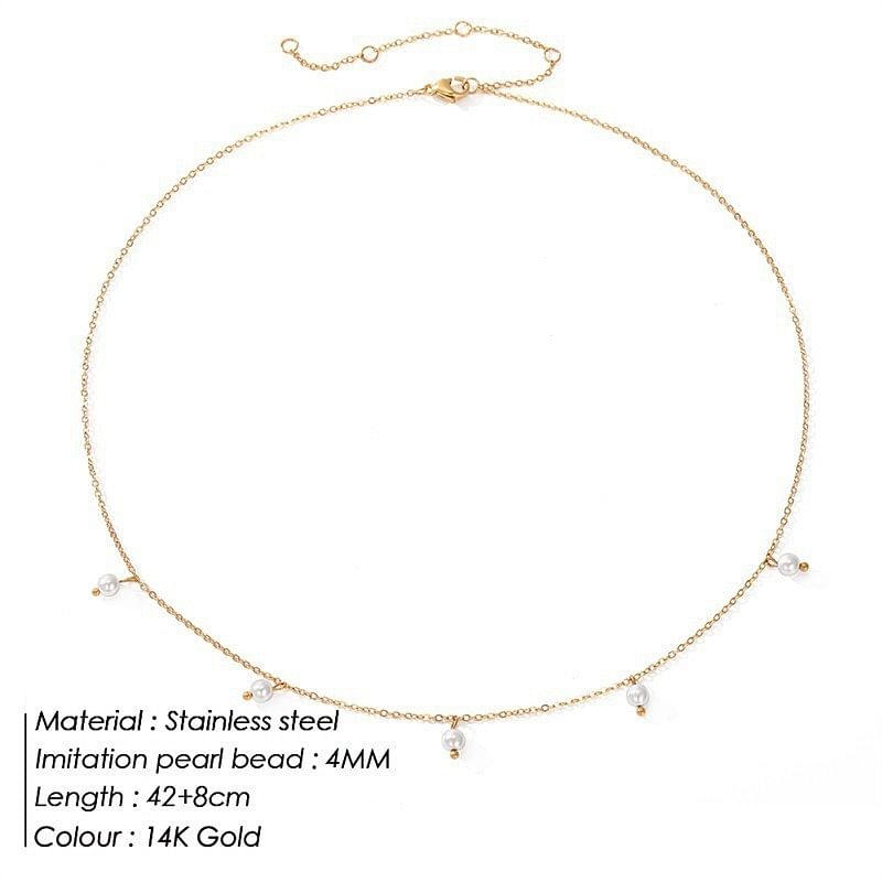
WHAT YOU GET: PAVOI Present this Cute Jewelry, Plated with 14k Rose Gold, Accompanied by Polished Pearls who Gives a Romantic Touch.
60-DAY GUARANTEE Your happiness is our number one priority. To ensure your complete satisfaction, we offer a hassle-free 60-Day money-back guarantee. To get in touch, email or chat with us – a member of our team will be happy to help you.
SUSTAINABILITY PAVOI is dedicated to sustainability throughout our entire product cycle. Our jewelry is made from 100% recycled materials and we package in 99% recycled and compostable materials. We work to reduce our carbon emissions and offset plastic consumption by removing 275,000 bottles from oceans annually. We are committed to maintain a balanced and eco-friendly business that minimizes our environmental impact. Trust that PAVOI is continuously working towards a greener future.
PROUDLY AMERICAN-OWNED
.aplus-v2 .premium-aplus-module-2 .premium-background-wrapper { position: relative;}.aplus-v2 .premium-aplus-module-2 .premium-intro-wrapper { position: absolute; width: 50%; height: 100%; top: 0;}.aplus-v2 .premium-aplus-module-2 .premium-intro-wrapper.right { left: 50%;}html[dir=’rtl’] .aplus-v2 .premium-aplus-module-2 .premium-intro-wrapper.right { left: auto; right: 50%;}.aplus-v2 .premium-aplus-module-2 .premium-intro-wrapper.secondary-color { color: #fff;}.aplus-v2 .premium-aplus-module-2 .premium-intro-background { padding: 20px;}.aplus-v2 .premium-aplus-module-2 .aplus-module-2-topic { padding-bottom: 10px;}.aplus-v2 .premium-aplus-module-2 .aplus-module-2-heading { padding-bottom: 20px;}.aplus-v2 .premium-aplus-module-2 .aplus-module-2-description { line-height: 1.5em;}.aplus-v2 .premium-aplus-module-2 .premium-intro-background.white-background { background: rgba(255,255,255,0.5);}.aplus-v2 .premium-aplus-module-2 .premium-intro-background.black-background { background: rgba(0,0,0,0.5);}.aplus-v2 .premium-aplus-module-2 .premium-intro-background.black-background,.aplus-v2 .premium-aplus-module-2 .premium-intro-background.black-background h1,.aplus-v2 .premium-aplus-module-2 .premium-intro-background.black-background h5,.aplus-v2 .premium-aplus-module-2 .premium-intro-background.black-background ol,.aplus-v2 .premium-aplus-module-2 .premium-intro-background.black-background ul,.aplus-v2 .premium-aplus-module-2 .premium-intro-background.black-background ol .a-list-item,.aplus-v2 .premium-aplus-module-2 .premium-intro-background.black-background ul .a-list-item { color: #fff;}.aplus-v2 .premium-aplus-module-2 .premium-intro-content-container { display: table; height: 100%;}.aplus-v2 .premium-aplus-module-2 .premium-intro-wrapper.left .premium-intro-content-container { padding-left: 40px;}html[dir=’rtl’] .aplus-v2 .premium-aplus-module-2 .premium-intro-wrapper.left .premium-intro-content-container {padding-left: 0px;padding-right: 40px;}.aplus-v2 .premium-aplus-module-2 .premium-intro-wrapper.right .premium-intro-content-container { padding-right: 40px;}html[dir=’rtl’] .aplus-v2 .premium-aplus-module-2 .premium-intro-wrapper.right .premium-intro-content-container { padding-right: 0px; padding-left: 40px;}.aplus-v2 .premium-aplus-module-2 .premium-intro-content-column { display: table-cell; vertical-align: middle;}/** * Premium modules global styles */.aplus-v2.desktop { max-width: 1464px; min-width: 800px; margin-left: auto; margin-right: auto; word-wrap: break-word; overflow-wrap: break-word; word-break: break-word;}/* Undo this for tech-specs because it breaks table layout */.aplus-v2.desktop .premium-aplus .aplus-tech-spec-table { word-break: initial; }.aplus-v2 .premium-aplus,.aplus-v2 .premium-aplus .aplus-h1,.aplus-v2 .premium-aplus .aplus-h2,.aplus-v2 .premium-aplus .aplus-p1,.aplus-v2 .premium-aplus .aplus-p2,.aplus-v2 .premium-aplus .aplus-p3,.aplus-v2 .premium-aplus .aplus-accent1,.aplus-v2 .premium-aplus .aplus-accent2{ font-family: Arial, sans-serif; }.aplus-v2 .premium-aplus,.aplus-v2 .premium-aplus .aplus-h1,.aplus-v2 .premium-aplus .aplus-h2,.aplus-v2 .premium-aplus .aplus-p1,.aplus-v2 .premium-aplus .aplus-p2,.aplus-v2 .premium-aplus .aplus-p3,.aplus-v2 .premium-aplus .aplus-accent1,.aplus-v2 .premium-aplus .aplus-accent2{ font-family: inherit; }/* type */.aplus-v2 .premium-aplus .aplus-h1 { font-size: 32px; line-height: 1.2em; font-weight: 500; }.aplus-v2 .premium-aplus .aplus-h2 { font-size: 26px; line-height: 1.25em; font-weight: 500; }.aplus-v2 .premium-aplus .aplus-h3 { font-size: 18px; line-height: 1.25em; font-weight: 500; }.aplus-v2 .premium-aplus .aplus-p1 { font-size: 20px; line-height: 1.3em; font-weight: 300; }.aplus-v2 .premium-aplus .aplus-p2 { font-size: 16px; line-height: 1.4em; font-weight: 300; }.aplus-v2 .premium-aplus .aplus-p3 { font-size: 14px; line-height: 1.4em; font-weight: 300; }.aplus-v2 .premium-aplus .aplus-accent1 { font-size: 16px; line-height: 1.4em; font-weight: 600; }.aplus-v2 .premium-aplus .aplus-accent2 { font-size: 14px; line-height: 1.4em; font-weight: 600; }/* spacing */.aplus-v2 .aplus-container-1 { padding: 40px; }.aplus-v2 .aplus-container-1-2 { padding: 40px 80px; }.aplus-v2 .aplus-container-2 { padding: 80px; }.aplus-v2 .aplus-container-3 { padding: 40px 0; }/* Display */.aplus-v2 .premium-aplus .aplus-display-table { display: table; }.aplus-v2 .premium-aplus .aplus-display-table-cell { display: table-cell; }.aplus-v2 .premium-aplus .aplus-display-inline-block { display: inline-block; }/* Aplus display table with min-width 1000px and fill remaining space inside parent */.aplus-v2.desktop .premium-aplus .aplus-display-table-width { min-width: 1000px; width: 100% }/*** Padding and margin for element should be 10, 20, 40, or 80 px. Considering mini 10, small 20, medium 40, large 80.*//** * Premium-module 8: Hero Video module */.aplus-v2 .premium-aplus-module-8 .premium-aplus-module-8-video { position: relative; width: 100%;}.aplus-v2 .premium-aplus-module-8 .video-placeholder { padding-bottom: 40.984%; /* Video or image required size 1464 : 600 = 40.9836 */}.aplus-v2 .premium-aplus-module-8 .video-container { position: absolute; top: 0; width: 100%; height: 100%;}/*Override the default VSE video player size*/.aplus-v2 .premium-aplus-module-8 .video-js.vjs-fluid { padding: 0;}/* * Used when device = desktop * Configured in: configuration/brazil-config/global/brand-story.cfg */ /* Because the carousel is implemented as an ol list, any lists in the card text will have a secondary list style (letters). This will give an incorrect appearance to viewers, so we set all lists to the primary list style (numbers). */ .aplus-brand-story-card ol li { list-style: decimal; } /* Top level containers */ .aplus-module .apm-brand-story-hero { -moz-box-sizing: border-box; -webkit-box-sizing: border-box; box-sizing: border-box; width: 1464px; height: 625px; background-color: #fff; } .aplus-module .apm-brand-story-card { -moz-box-sizing: border-box; -webkit-box-sizing: border-box; box-sizing: border-box; width: 362px; height: 453px; background-color: #fff; } .apm-brand-story-hero, .apm-brand-story-card { -moz-box-sizing: border-box; -webkit-box-sizing: border-box; box-sizing: border-box; position: relative; width: 100%; height: 100%; float: none; } .aplus-module.brand-story-card-1-four-asin .apm-brand-story-card { /* Only 12px to account for image cell border */ padding: 12px; } /* Full background image (Hero 1 & Card 2) */ .aplus-module .apm-brand-story-background-image { -moz-box-sizing: border-box; -webkit-box-sizing: border-box; box-sizing: border-box; overflow: hidden; position: absolute; width: 100%; height: 100%; } /* Card 1 small images */ .aplus-module .apm-brand-story-image-row { -moz-box-sizing: border-box; -webkit-box-sizing: border-box; box-sizing: border-box; height: 185px; padding: 0px; margin: auto; display: flex; } .aplus-module .apm-brand-story-image-row .apm-brand-story-image-cell { /* Use content-box to ensure image size matches editor schema */ -moz-box-sizing: content-box; -webkit-box-sizing: content-box; box-sizing: content-box; padding: 0px; margin: 0px; width: 166px; border: 1px solid #fff; } .aplus-module .apm-brand-story-image-row .apm-brand-story-image-cell .apm-brand-story-image-link { display: block; width: 100%; height: 100%; } .aplus-module .apm-brand-story-image-row .apm-brand-story-image-cell .apm-brand-story-image-link .apm-brand-story-image-img { display: block; width: 100%; height: 100%; object-fit: cover; } /* Card 3 logo image */ .aplus-module .apm-brand-story-logo-image { -moz-box-sizing: content-box; -webkit-box-sizing: content-box; box-sizing: content-box; height: 145px; margin: 0px 4px; padding: 20px; padding-bottom: 0px; } /* Text overlays */ .aplus-module .apm-brand-story-text-bottom { -moz-box-sizing: border-box; -webkit-box-sizing: border-box; box-sizing: border-box; position: absolute; bottom: 13px; left: 13px; } .aplus-module .apm-brand-story-hero .apm-brand-story-text-bottom { background-color: rgba(0,0,0,0.6); color: #fff; padding: 13px 65px 13px 13px; /* accounts for overlap of first card */ width: 437px; } .aplus-module.brand-story-card-2-media-asset .apm-brand-story-text-bottom { background-color: rgba(255,255,255,0.6); color: #000; padding: 13px; width: 336px; } .aplus-module.brand-story-card-1-four-asin .apm-brand-story-text { margin-top: 8px; } .aplus-module.brand-story-card-1-four-asin .apm-brand-story-text.apm-brand-story-text-single { margin-top: 20px; } .aplus-module.brand-story-card-1-four-asin .apm-brand-story-text h3 { white-space: nowrap; overflow: hidden; text-overflow: ellipsis; } .aplus-module .apm-brand-story-slogan-text { -moz-box-sizing: content-box; -webkit-box-sizing: content-box; box-sizing: content-box; margin: 0px 4px; padding: 20px; } .aplus-module .apm-brand-story-faq { -moz-box-sizing: content-box; -webkit-box-sizing: content-box; box-sizing: content-box; padding-top: 10px; } .aplus-module .apm-brand-story-faq-block { margin: 0px 10px; padding: 10px; }.aplus-v2 .apm-brand-story-carousel-container { position: relative; } .aplus-v2 .apm-brand-story-carousel-hero-container, .aplus-v2 .apm-brand-story-carousel-hero-container > div { position: absolute; width: 100%; }/* Ensuring the carousel takes only the space it needs. The sizes need to be set again on the absolutely positioned elements so they can take up space. */ .aplus-v2 .apm-brand-story-carousel-container, .aplus-v2 .apm-brand-story-carousel-hero-container { height: 625px; width: calc(100% + 15px); max-width: 1464px; margin-left: auto; margin-right: auto; } /* This centers the carousel vertically on top of the hero image container and after the logo area (125px). Margin-top = (heroHeight – cardHeight – logoAreaHeight) / 2 + logoAreaHeight */ .aplus-v2 .apm-brand-story-carousel .a-carousel-row-inner{ margin-top: 149px; } /* Cards need to have a width set, otherwise they default to 50px or so. All cards must have the same width. The carousel will resize itself so all cards take the width of the largest card. The left margin is for leaving a space between each card. */ .aplus-v2 .apm-brand-story-carousel .a-carousel-card { width: 362px; margin-left: 30px !important; } /* styling the navigation buttons so they are taller, flush with the sides, and have a clean white background */ .aplus-v2 .apm-brand-story-carousel .a-carousel-col.a-carousel-left, .aplus-v2 .apm-brand-story-carousel .a-carousel-col.a-carousel-right { padding: 0px; } .aplus-v2 .apm-brand-story-carousel .a-carousel-col.a-carousel-left .a-button-image, .aplus-v2 .apm-brand-story-carousel .a-carousel-col.a-carousel-right .a-button-image { border: none; margin: 0px; } .aplus-v2 .apm-brand-story-carousel .a-carousel-col.a-carousel-left .a-button-image .a-button-inner, .aplus-v2 .apm-brand-story-carousel .a-carousel-col.a-carousel-right .a-button-image .a-button-inner { background: #fff; padding: 20px 6px; } .aplus-v2 .apm-brand-story-carousel .a-carousel-col.a-carousel-left .a-button-image .a-button-inner { border-radius: 0px 4px 4px 0px; } .aplus-v2 .apm-brand-story-carousel .a-carousel-col.a-carousel-right .a-button-image .a-button-inner { border-radius: 4px 0px 0px 4px; }
Additional information
| Weight | 0.67 lbs |
|---|---|
| MPN | D0101H2BBDG |
| CONDITION | New |
| COLOR | GOLD |


Reviews
There are no reviews yet.